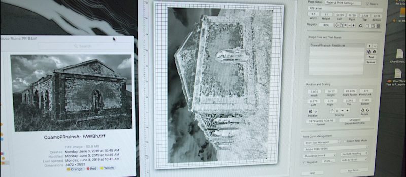
The Deep End of the Technical Dive
This is some pretty technical stuff for those who have never been near a darkroom or have never used a digital image editor. I’ve spent many hours going through what ‘others’ have done, sifting for ideas. This effort is a moving target that can be hard to get in front of. That means I’m also trying to do some ‘catch-up’ of my own.
However, if making your own inkjet digNegs is not in your future, this will bore you to tears. If you are looking to make digiNegs from an inkjet printer, this just might make for an interesting read.
So here goes…
Notes: This article was way too long so I’ve split it into the ‘why of diginegs’ and the setup of the inkjet printer though both articles feature content about the other. Part 3 will follow sometime later.
While writing this, I did take a fresh look at the AltPhoto DigiNeg solutions as they stand right now. How any of this will correlate to the changes coming to Apple’s MacOS depends on software developers porting new versions of their work to Apple Silicon. That includes drivers for printers, scanners and any other computer driven instruments. Apps that only run on Intel are not supported, starting with the next MacOS update- V28.
 A screen-grab of the Mac desktop notice regarding V28
A quote from Apple corporate: “When opening an Intel-based app, you might be notified that support is ending for Intel-based apps, and that the app or a component used by the app will not work with a future release of MacOS (MacOS 28)”. My M1 MacBookPro is running V26.7 so I’ll stick with that for now. Nor are any A.I. enhancements needed to do the work I do.
Also Note: digiNeg… is a term you will see repeated over and over again. A generic term referring to any digitally rendered negative intended for contact printing in the darkroom, including negatives made from a laser-printer, inkjet-printer or prepress imagesetter. The abbreviated spelling is open for debate, but I’m going with digiNeg for now.
The Digital/Analog Mashup
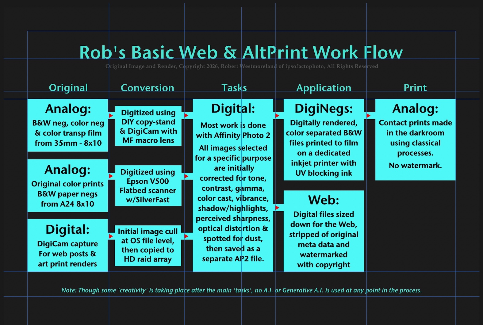 Rob’s basic work-flow
The Primary Goal
To develop a process of making classical prints in the darkroom from inkjet rendered negatives, specifically contact prints, should be one that is- ‘easy to replicate’, ‘easily adaptive to different print processes’, as well as ‘digitally intuitive’. What I mean is, a process that minimizes repeated ‘corrective trial and error’ cycles while keeping costs down.
That’s it, that’s the goal some of us are chasing.
How does this work with print processes from the past?
With the exception of conventional B&W photo-paper, most of the old print-processes rely on using a dichromate as the emulsion sensitizer. I’m not going into the health issues now, but will when I start using it. Dichromates are light-sensitive to a very narrow band of light, Ultra Violet Light (UV). And lots of it. The UV spectrum is the same type of light used in gear made for photo-offset prepress departments of the previous era.
For this to work, whatever one uses to ‘image’ to these UV sensitive processes must be very good at blocking UV light.
An Epson® inkjet printer that features pigment based inks versus traditional inkjet inks can block UV light, but not in all cases. It depends on the color. Furthermore, there are third party inksets for these Epson® printers, specifically dedicated to rendering digiNegs. Cool.
Much more detail regarding the ‘printer’ is covered in Part 2, but what matters is, its ability to block UV light. The inkset in a cheap inkjet printer will not cut it.
So how are other folks making inkjet digiNegs?
The approach I’ve taken is not how others elect to tweak the digital tone-scale to fit the contact print process. Several methods require the use of a Spectrophotometer or densitometer reading dozens or hundreds of values every time you need to adjust a formula or change paper type. If you are making dozens of prints per run, this works well, but the moment you change anything, a new set of test negs and test prints must be generated to create a new ‘curve’.
This is also true of the approach I’m working on, but there are a couple of big differences.
I don’t find this hardware heavy approach particularly ‘intuitive’… more tedious than anything. Plus a lot of the alternative or classical print processes are prone to ‘tone irregularities’ from print-to-print that play havoc with trying to nail-down precise ‘readings’. Prints made to textured watercolor paper are most problematical for the smaller ‘aperture’ on less expensive models. Yes, the pro models intended for textiles do feature a larger aperture for a better ‘averaged’ reading.
 My original iONE reflection densitometer. It was ‘new’ in 2004
Maintaining this type of digital workflow is subject to potential conflicts between third-party software updates versus system OS updates (like MacOS v28). Don’t get me wrong, this more ‘instrument dependent’ approach is used effectively by those working at a high rate of production. And I’m sure new, updated software will be made available, if not already.
George Jetson would be amazed… needing to push the button 120 times or more.
Unfortunately, my ‘like-new’ iOne is over 20 years old. Any of the third party ‘drivers’ from back then, will not run on MacOS V28. The cost of a new iThree is prohibitive for anyone making less than a few dozen prints a month. There is something in the $300-$350 range that will do the job. But it still seems like ‘digital overkill’.
Thing is, 125 years ago, they made it work without a bunch of specialized gear. I want an approach that capitalizes on our digital capability without overburdening the process with repetitive tasks or use AI of any kind.
An alternative solution- a ‘balanced’ master DigiNeg
Work from a master digiNeg that can be used as a starting point with any contact print process and skip the Spectrophotometer entirely.
A ‘master digiNeg’ that allows me to visually evaluate a fully processed contact print and ’see’ which set of adjustments best fits my current configuration (as it specifically relates to the print process used). I’ve seen similar composite contact ‘test’ negs from Kodak. So I’m not re-inventing anything, just appropriating a good idea. And I’m sure others have created similar sample or master digiNegs for the same reason as I.
But before any contact printing can begin, one must determine a ‘minimum exposure’ to paper, that will render a solid black. For that, I employ a Stouffer® 21 step grayscale using the basic ‘step and repeat’ technique. The uncalibrated version is all that’s needed.
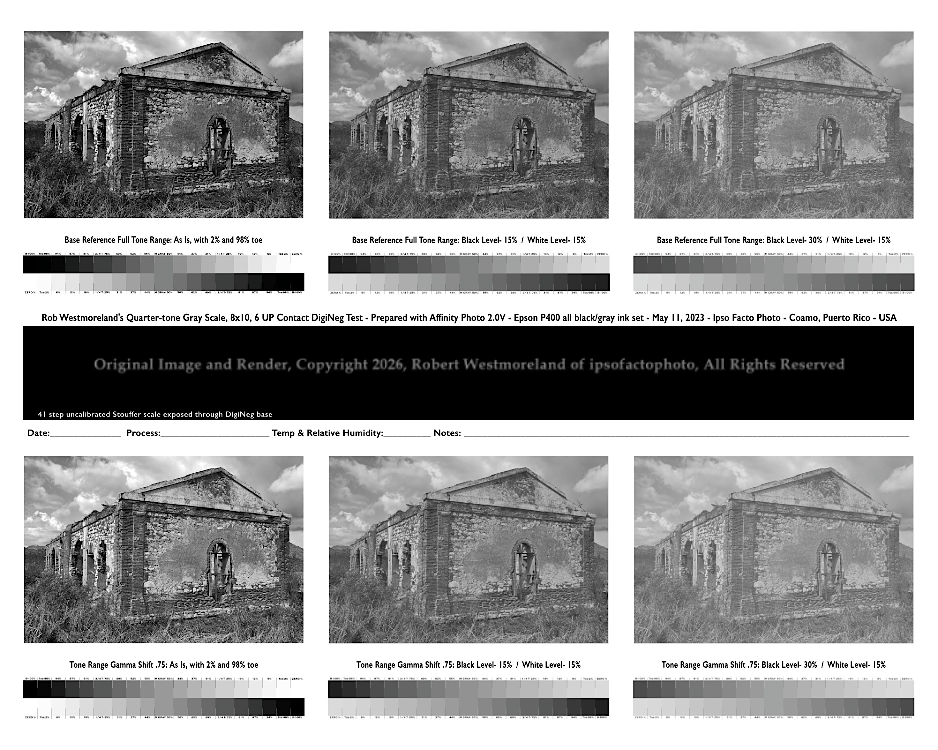 Second composite digiNeg image, just prior to ‘inversion’ into a negative. This makes for a simple ‘guesstimate’ of the corrections needed, the black box is a window for a 41 step Stouffer® scale taped to position for exposure confirmation and contrast evaluation.
The master digiNeg is composed of three key components:
A series of 6 or 9 tone-curve variations applied to the same B&W digital image.
A corresponding digital ‘quarter-tone grayscale’ matching the sample images.
And a window (or two) for a Stouffer® grayscale scale, taped to it. (21, 31 or 41 step)
With this master digiNeg I can easily make a judgement call as to whether it’s ‘too much or not enough.’ If one of the curve preset ‘tweaks’ looks good, I can make that adjustment and go straight to making the final, ‘full size’ digiNeg based on that set of values. Or, if needed, push those values up again, then render a ‘2nd level’ master digiNeg which I can always use for future testing.
Editing the digiNeg curve in a photo app
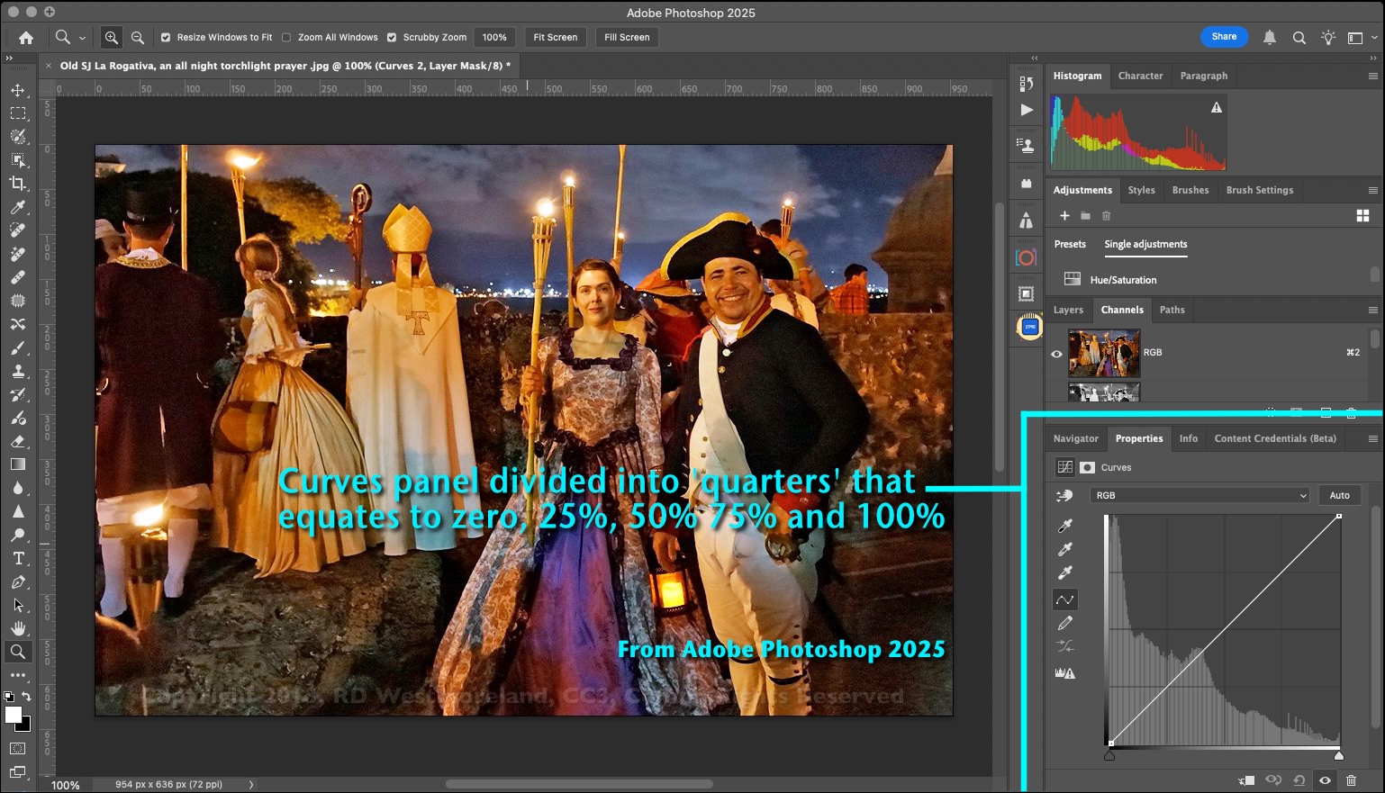 Tone scale ‘curve’ from Adobe® Photoshop® 2025
As an early adopter of Photoshop®, I always liked how the ‘tone scale’ was represented by a box with a diagonal straight-line, running from corner to corner, divided into quarters that correspond to key ranges within any image. In the two examples, anyone familiar with an upscale image editor, has already seen what I’m talking about. You simply grab the diagonal line and move it around to make ‘tone scale’ adjustments that have little to no effect on the colors of an image. You can also add key ‘points’ along the curve, to force it into something you want. The effect can be subtle or dramatic, depending. It can also be destructive if you’re not careful.
This common black and white curve box, divided into quarters, is the basis for building a digital scale, incorporating the same key points of interest.
 Tone scale ‘curve’ from Affinity® Photo 2
The Digital Quarter-tone Gray Scale (DQTS)
I started with this thought-
“I need a digital tone-scale that matches the curve scale of the App versus what the print is actually capable of rendering. Not 100, but more like 15-20 discernible steps.”
 A 15 step quarter-tone gray scale of 5 key values plus toe of 2% & 98%
To state the obvious- The digital scale is defined by, white as Zero, black is 100 and a middle shade of gray as 50. Three basic values. Then split those three tones producing a light intermediate gray at the 25 mark or ‘quarter-tone’ and a dark intermediate shade of gray at the 75 mark or ‘three-quarter-tone’ value.
So to be clear, I’m applying my curve corrections directly to the positive digital image, prior to conversion to a neg, then output to the inkjet printer, without touching the ‘printer optimization’ that’s already been done. (Unlike some software approaches that apply the ‘adjustment curve’ to the printer-ink-output values instead.)
Quarter-Tone Values Matter!
This digital scale gives me the five most critical values* as it concerns adjusting a grayscale curve for the print process used. Regardless of how many steps the grayscale has, these five are the most critical. Why? Because if you nail down these five, all the rest will fall in place. Well, 95% of the time. As with most things, there are no absolutes.
Being able to ‘flip’ the grayscale back and forth from pos to neg and back again, should make for a more balanced evaluation.
But more steps the merrier! We should be able to define more than 5 patches, right? When making halftones off the back of a process camera I could easily define 95 values with the aid of a densitometer. I need to state that though a few photo-print processes are capable of rendering well over 100 or more distinct values, many cannot. Cyanotype is probably the worst at fine-tone differentiation. I have no issue with paper texture, but densitometers struggle to accurately read it. So I really don’t need a grayscale that renders a hundred values. Especially since I will only be tracking the five most critical.*
*Well.. plus two more values for a total of seven. But I’m getting ahead of myself.
 Robs quarter-tone digital scale with 9+2 and 17+2 values, for 11 and 19
The first scale incorporates one intermediate step between each of the primary for a total of nine evenly distributed values. To a second digital scale, I added three intermediate values between each of the basic five for a tone-scale of 17 evenly distributed values (some rounding of numbers was involved).
Honestly, if I can differentiate this range of values consistently, I’m doing great. It must be obvious by now, you can have as many steps as you want as long as it incorporates the ‘basic 5+2’. The 25, 50 and 75 patches are made slightly bigger so as to simplify evaluation.
Oh My, a toe or two…
But this effort is predicated on making prints, right? We want as long of a definable tone-scale as we can achieve without going off either end of the scale, right? Otherwise issues of contrast might creep in.
Slight variations in temp, humidity, timing of processes, or the condition of the chemicals used, may affect sensitivity or contrast of the print process used. So I built-in a slight ‘fudge-factor’. I added a 2% toe to the highlight end of the scale and a 98% step to the shadow end of the scale. That way you can tweak the contact print exposure a little, up or down, without making an entirely new digiNeg. It may not be discernible on your computer, but the 2%/98% toe is there. Nor may it show on the contact print, depending on the process used. That might indicate a slight increase in contrast or something else.
Studying digiNegs and contact prints with a 10x loupe, helps.
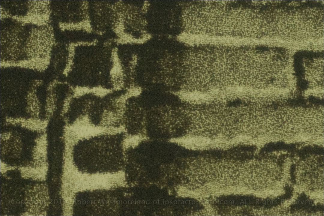 Macro detail of inkjet digiNeg , similar to stochastic screen tech, but in ’shades of gray’
9 or 17 Plus 2 = quarter-tone scales of 11 or 19 steps
So in addition to the basic 9 or 17 gray patches, I added two more values. This gives us a total of 11 or 19 definitive values. That 2% toe redefines a full range limited to 96%, not 100%, of whatever the print process is capable of. This means there are 7 key values to track. Not 128 or 256.
 A double pass, 19 step quad-tone digital scale
At this point, some uncalibrated displays may fail to show these very subtle differences.
Adding a ‘toe’ to the negative is how you allow for that ‘float’. This accommodation ‘should’ work for any process that works from a contact digiNeg. We shall see.
These custom quad-tone digital scales are what my effort revolves around. A digital point of reference that can be easily replicated, regardless of whether it’s a digital or analog original.
A B&W tone scale in 5% increments would also work, though I think a 5% ‘toe’ is a bit much. That equates to a potential 10% loss of definable tone-range. I can live with 96%± accuracy.
This is not a new idea, either. The rebate, or unexposed area around a frame of 35mm film is deliberately darker than the clear film-base the emulsion rests on… so a little more exposure can be applied without collapsing the shadows of the print.
It means none of my digiNeg images have an absolutely ‘clear’ area or an absolutely solid area on film. 98% black on film (highlight of the print) might look like a solid to the naked eye, but a little UV light will get through. Of course this is based on whatever the deepest, darkest value the printer is capable of, without making a muddy puddle. Yes, we are pushing the printer’s limits as much as we can so we can render as much tone-definition as the printer is capable of.
File Designation CCP- Corrected Curve Profile
As mentioned above, that scale of Zero through 100 is the same basic scale most digital imaging apps lean into when manipulating a ‘B&W tone curve’. Some apps allow you to ‘save’ that modified or ‘Corrected Curve Profile’ (my file designation) and apply it to ‘other’ images. Saving them is important because that’s how I bend the tones of an original image to match the print process being used.
LUTS
Another approach to ‘custom curves’, saves the ‘tone profile’ as a LUT file (Look-Up Table). Basically it’s a way to save the ‘look’ of an image and apply it to other images. (So another approach directly applied to the image.) This is a carry-over from cinematography using film, as it’s critical that all the film used in a particular production ‘looked the same’. LUTs can be saved as their own reference file and are sharable across most photo applications. There are 1,000’s of ‘LUT LOOKS’ on the Net, most are free. Is it cheating to use another’s LUT? Regarding comm advertising, probably not. Everything else, I’m not sure. LUTs obviously deserve their own post, so, later.
I consider LUTs as ‘Option 2’, or maybe a combination of both. More experimenting is needed.
A Vacuum Frame to Minimize Detail & Tone degradation
Please understand that a failure of intimate contact between the negative and print will have a direct effect on both the perceived resolution and the overall contrast of the final print. That might be a good thing under some circumstances, but mostly not. Yet another reason I favor a used plate-burner over any other UV exposure system. They all incorporate vacuum frames. This is how you preserve as much image detail and tonal separation as present in the digiNeg.
In conclusion…
I settled on a method of digiNeg ‘tone-curve’ evaluation and manipulation based on a master digiNeg with 6 or 9 image variations, plus a digital quad-tone scale featuring seven primary values. Plus a Stouffer 21 step contact scale (or 31 or 41 step). Observable with a 10x loupe, with or without the aid of a UV densitometer, as applied to the digital image, before conversion to a neg.
Part 2 deals directly with the inkjet printer and the inkset used..