Inkjet Printer Considerations
Note: I will be repeating a few things so as to setup for what comes next.
This master digiNeg approach will or ‘should’ work regardless of the printer or inkset used. And it needs to be repeated- you must know in advance, which inks in an inkset block UV light and which don’t. There’s a third-party Epson® printer ink profiling tool for that too. A UV transmission densitometer can be used to track and chart your ‘best guess’… by taking readings directly from the master digiNeg quarter-tone scales. But really, you don’t have to have a UV densitometer to make this work, Since it becomes pretty obvious which inks block UV and which ones don’t, though a 10x loupe is still a good idea.
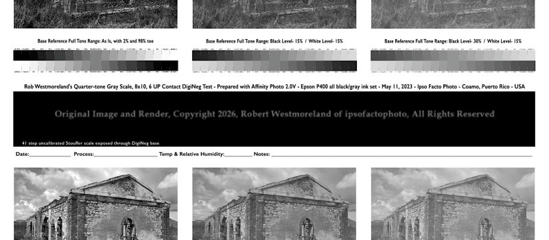
This ‘should’ mean you can tailor the ‘master digiNeg’ to match the adjustment ranges YOUR image editor is capable of. These master digiNegs can easily be scaled to fit half and full sheet test prints. Anything smaller than 8×10 or half of an 11×14 might be hard to evaluate without a 10x loupe. Especially as it concerns photo-prints made to textured watercolor paper.
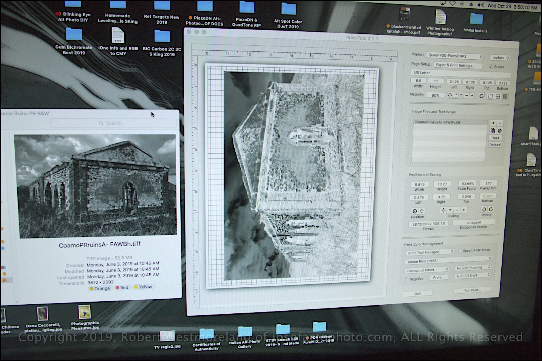 My first digiNeg to print. Roadhouse ruins of Santa Isabel, PR
The ‘other’ critical component, the printer
What follows is ‘printer specific’ and will be subject to some experimentation.
For this to work, it’s important that you have access to the printer’s ‘ink-level output’. Control over the ‘rate of ink delivery’ to paper (or clear base) is critical to creating the best digiNeg possible. We need to lay down enough ink to fully block UV light, but not so much that it leaves a puddle or makes track marks across the digiNeg as it passes through the printer. That is the balance we are after.
Fortunately, there is some spiffy software to do just that.
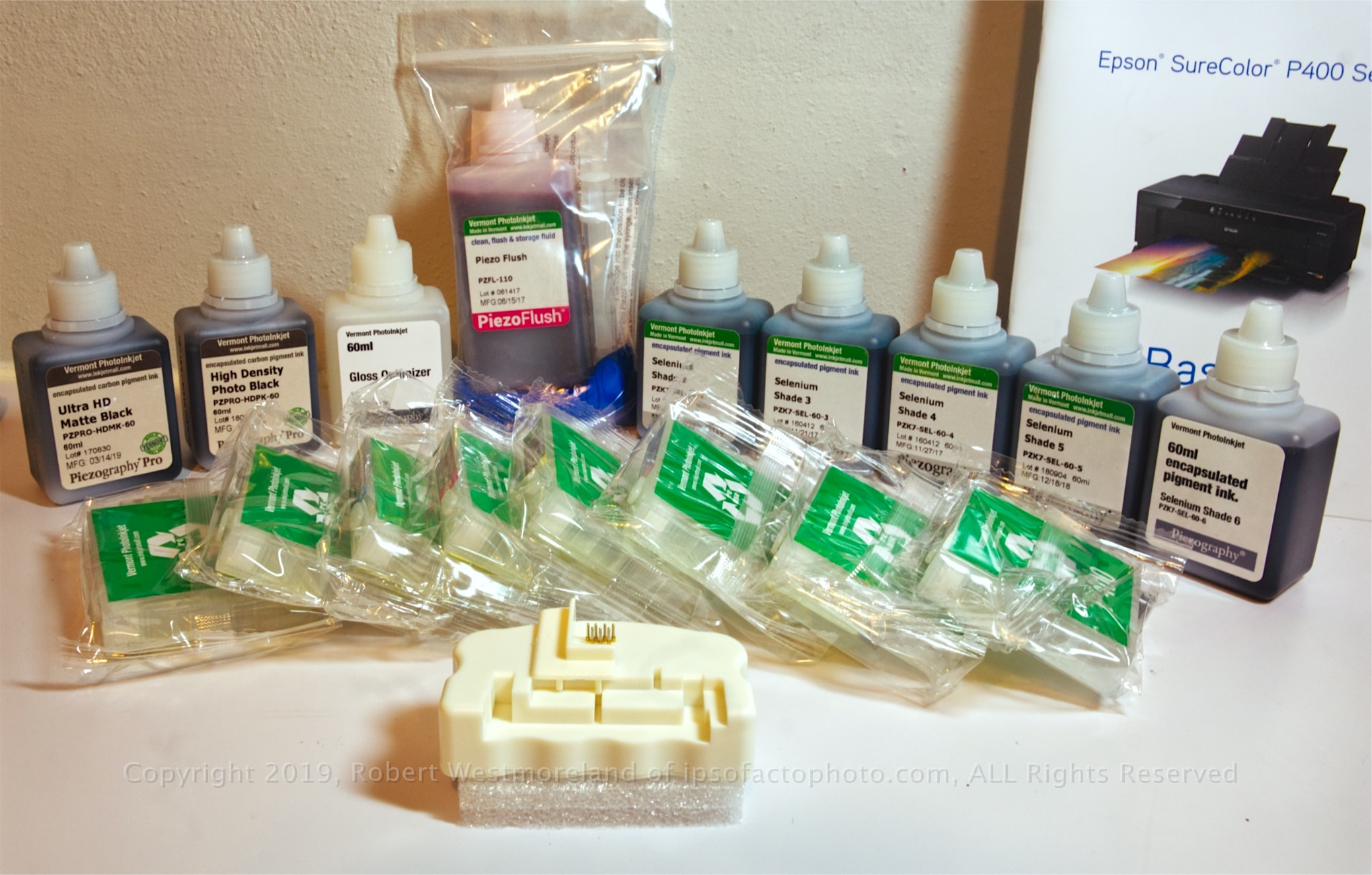 All gray ink-set for Epson P400 inkjet printer with chip-resetter
Proposed ‘ink output values’ will need to be adjusted, but this should give me a clean starting point.
As it relates to a third-party ‘all-shades-of-gray’ inkset, what constitutes a nice smooth set of overlapping curves is still subject to debate. After following the assorted threads on the subject, I started sketching out my own, based on a quarter-tone graph I made. I have yet to apply these curves to the printer ink output values, so it’s a work in progress. There will be a follow-up post (#3).
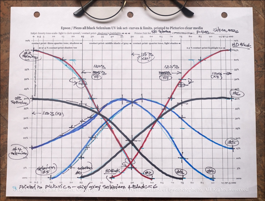 Proposed ink distribution- 5 shades of Selenium + HD Photo Black for P400 printer. Error- QT and 3QT 122.5% instead of 120%
100% Plus…
Basically, there is only so much ink you can put down before it becomes a wet muddy puddle. That limit correlates to what the transparent substrate will tolerate. That’s why Pictorico is so popular, it will take a lot of ink, more than most. Obviously, the more ink you can put down, the better it’s going to block UV light.
Those that don’t block UV need to be minimized so they don’t contribute to the ‘puddle’. That can be made to work, but I prefer an all-black shades-of-gray digiNeg. It makes it a lot easier to make simple observations about ‘tone density’ when it’s all the same gray… Which in turn, makes for a more intuitive evaluation.
 My X-Rite 361 UV transmission densitometer
I’ve kept my rant about densitometers to a minimum since they can serve a critical need. In this case, as it specifically concerns the ability of inkjet ink to block UV light. And measure it consistency from one digiNeg to the next. You just can’t have those values floating away from you, once you start making prints.
So I scored a used X-Rite® 361-T from stateside.
It’s a B&W transmission densitometer for specifically measuring Ultraviolet light. That’s all it does. It did come with a reference scale to calibrate the device as well. Now I can precisely measure the actual UV light blocking capability, relative to inkjet rendered gray patches on film. It’s pretty easy to keep track of just 7 readings per past, twice that for a a double sided quad-tone grayscale. Instead of methods using 128 or 256 individual readings. I can live with 14. Reading two different scales from the same digiNeg helps verify any tone-scale variations that crop up. So I split the diff and go with the average of the two.
It’s important to keep in mind, the inkjet tone-scale gets flipped from a positive to a negative, during the contact print process.
The light-light-gray #2 selenium ‘ink’ will actually be rendered as a near solid black on the print. Same can be said about the print’s highlights, which will be defined by the dark-dark-gray #6 Selenium and solid black ‘inks’.
My P400 inkjet, Expired…
I chose the Epson® P400 because it could do the job and was reasonably priced. The P400 is/was the least expensive 13”x19” (A3+) inkjet with pigmented ink Epson® sold. It featured an 8 channel print head that delivered 6 specific values, plus an optional matte black and clear gloss overcoat. It ‘was’ a good fit for an ‘all-shades-of-gray’ ink set.
It’s since been discontinued. That leaves the more expensive 13” wide P-700 with two more inks and the 17” wide P-900 which is overkill.
To date, I’ve only fired up the P400 maybe 4 times since I got it.
Printer Setup
I started with a brand new printer so I did not need to ‘flush it out’ before loading it with an all-black, shades of gray inkset. That of course, immediately nullified the warranty from Epson®. The initial setup was somewhat tedious. I installed new third-party carts I filled myself, with 5 shades of Selenium ink, plus the High Density Photo Black. A third-party inkset that was specifically intended for making digiNegs.
As mentioned earlier, I’m printing to ‘Pictorico Ultra Premium OHP’. Pictorico® also makes a white translucent version that passes a smooth, diffuse light. I also have some less expensive clear-base to run tests on. That should work well for digiNegs intended for conventional light-sensitive photo-paper when exposed to the K&M point light exposure unit, via a vacuum frame.
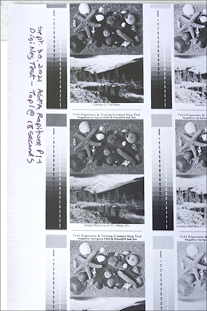 Contact print from an inkjet digiNeg, on expired Kodak Poly-contast photo-paper
Hold on, just a Sec
Before making that first digiNeg contact, you gotta define the ‘minimum baseline exposure’ to achieve a genuine solid black that the print process is capable of. So it’s ’Step-and-Repeat’ with the Stouffer 21 step scale until you nail it.
Once you know what a good solid black looks like, use the master DigiNeg to ‘proof’ the tone range.
Without going too sideways, a polycontrast B&W paper would allow you to tweak the paper contrast to fit the digiNeg and I’ll experiment with that approach too. BUT manipulating the contrast-range of the print would usually not be needed. I also have some expired single-contrast B&W photo-paper to mess with.
Exposure Tip- It’s always better to start with over-exposure and cut back versus starting below the minimum threshold and adding more and more exposure.
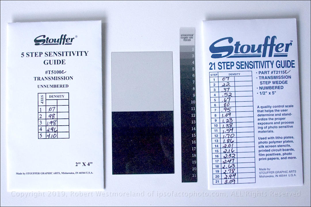 Calibrated Stouffer® scales for precise calibration of densitometer and 21 step contact exposure.
Regarding a Stouffer® scale, a cheap uncalibrated 21 step, transparent version is all you really need. This small B&W scale is a ‘must have’ for any contact work, regardless of the process. Stouffer® still makes them… all kinds of grayscales. It will quickly tell you if you have overexposed your print-paper. At least one 21 step scale should be used with every digiNeg.
That makes up the third critical feature of a master digiNeg.
Classic Trial and Error
Actually, my first attempt at making ‘contact digi-negs’ was with a simple Brother B&W laser printer. We have one for printing docs so I tried it. I did not use any special software for it. Simply the Affinity Photo® App and the printer driver Apple® had for it. Its native resolution is only 300dpi, but can be manually bumped to 600dpi. Still not that great. There was some obvious streaking and solid black was not that solid. That could be due to the cheap clear base I was printing to. It would require further testing so it’s something I might come back to. Thing is, this laser printer would never be a substitute for a dedicated inkjet printer.
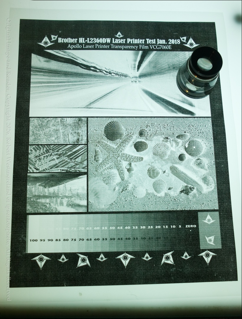 Brother Laser-printer DigiNeg
So this is as far as I’ve got for now…
I’m close to a digiNeg solution as soon as I get back to making more. Assuming the Epson P400 hasn’t suffered total failure from sitting so long, without running anything through it. My bad.
I’ll also delve more directly into contact prints made to B&W photo-paper based on the one digiNeg I have produced to date with Part 3.